
10 Jul Why You Should Maintain Consistency in Branding and Web Design
Brand consistency is the expression of design that affects what people think about your company. Your brand should be able to build awareness and develop trust and loyalty with your customers if you maintain consistency in branding and web design. You can also search for help with branding strategy services to make your branding more successful.
It’s very easy to create digital content like articles, blog posts, e-books, etc. With Internet connection and standard business software, almost anyone can create content that contains his/her version of brand outlook or message, but this should not be your approach. Don’t leave your brand open to interpretation and manipulation. You need to create a unique personality for it, and frequently changing designs cannot create a consistent personality for a brand. This is the reason brand consistency is essential.
A good brand is built over time and requires the right school of thought, strategy, and consistent implementations. Let’s take look Heinz- a perfect example of taking brand consistency to the next level.

Your brand is the story that connects people to your service or products. If the look of your website matches the narrative of your business, your business will look more engaging and authentic to your users. And, that’s the reason infusing brand consistency into your website design is so much important.
Everything from colors, fonts, elements to layout, template play crucial roles in representing your brand. The web design should not be bold, cluttered, or overdone.
You can follow the next 6 steps to build brand consistency into your website.
- Play Smart With Color
Each color you use on your website affects people who visit your website. Each color has the unique ability to evoke emotion in the mind of people.
It’s all about the science of color. Choosing the right color for your brand gives your audience more insight into what your brand approach is all about. For example, Black and Red feel edgy, while Brow and Green feel more earthy. If you are selling bouncy jump houses for the kids, using black for the designing your website won’t be a right idea.
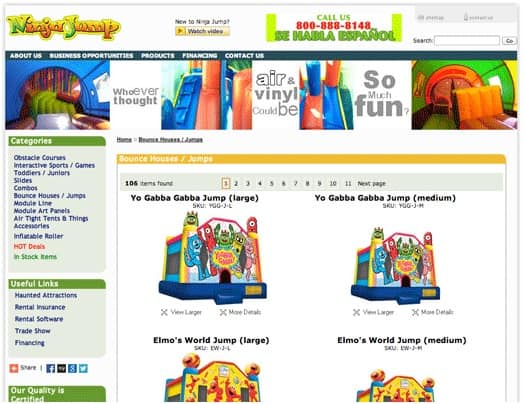
Look at the site above- NinjaJump.com and see how they are using different bright colors like Red, Greens, Blue to make it more kids-oriented.
On the other hand, if women are the target audience of your products or service, using Black or White would be the right idea.
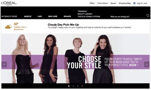
Look at the official website of L’Oreal and see how they are using the combination of Black, White, and Purple overlay.
Once you have determined the primary and secondary colors of your brand, it’s time to integrate them into your website. Starting with a dominant base color which you have used on your logo would be a smart idea. Use the base color on places like headlines, subheadings, background images, and illustrations.

The proper color coding keeps your website look sharp, clean, and uncluttered.
- Have A Right Message For Your Brand
Although exciting colors and a meaningful logo is essential for your branding, all your branding venture is incomplete if it doesn’t have a message which can build a brand image. Most successful brands use websites to demonstrate how they are the best in the market. It’s good if you can show your awards and expertise in your field. You should not forget about the requirements of your customers and use messaging to let them know how you would be able to help them with your product or service.
For example, Nike has always celebrated the athletes and, the dedication and passion that brings the best performance. The simple tagline “Just Do It” straightforwardly expresses the drive and determination.
- Unleash The Power Of Whitespace
Although it feels tempting to fill up every square inch of your website with content, the importance of the whitespace should not be ignored.
Adding whitespace to your website design for your brand enhances the span of attention and comprehension rate by 20%. Below is an example of how popular sites use whitespace.

Maintaining a proper balance of visual content with strategic whitespace makes your website look organized, polished, and accessible.
- Use Simple Fonts
Just like the color of your brand, the typeface of your website should be uniformed across the board. There are many types of fonts, but, using too much variety will distract the users from your brand’s message. When it comes to the fonts, the best approach is to choose two fonts that complement each other and support the overall tone of your brand.
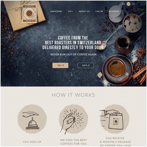
Look at this coffee selling website above and, see how nicely they use the fonts.
- Place Your Logo Perfectly
The logo creates the first impression about your business when someone comes across your brand. The best logos always come with a combination of professionalism and personality.
Placing the logo in the right manner is very important for your business website. For example, placing it near the top left corner is a smart idea as the majority of the language are written from left to right.
- Compliment Your Content With The Right Image
The graphics on the website of your brand should not be flashier than the message it’s trying to communicate.
If you are running a product based business, use high quality of photographs of your products so that your readers can get the best idea without even reading a word.
You can also experiment with the background and banner images to refine the brand identity and add more dimension to it.
Consistency builds a sense of familiarity and trust for your brand personality. Consistent web design serves a lot of positive purposes for your brand, making it more cost-effective and convenient for your users.
–
ABOUT THE AUTHOR
Payal is a Content Consultant at Enuke Software, a pioneering Blockchain and Mobile App Development Company in the USA. Payal is passionate about the start-up ecosystem, Crypto world, entrepreneurship, latest tech innovations, and all that makes this digital world.


No Comments