31 Jan 7+ Stunning Website Layout Examples
Art can be of any form. It doesn’t matter if it is not on paper. It can be on the internet flowing in the form of 0’s and 1’s.
Yup, the websites that we see around are a great way to relish creativity and artform. These stunning website layouts keep the visitors hooked and also provides inspiration to the designers.
A great website is a balance between interactivity, sound design, design aesthetic, usability and code readability(taking in account that it will be maintained later).
Websites Layout, on the other hand, vary over the internet. Some are common and some are quite outstanding and some are just beyond imagination. It all depends on the requirements of the project and each project demands a unique solution.
In today’s post, we will go through stunning website layout examples. The examples showcase the creativity of the designer and also provides the much-needed inspiration for the readers.
So, why the wait? Let’s get started.
Table of Contents
Stunning Website Layout Examples
The list of the stunning website layout is hand picked and looks great. All these websites carry a uniqueness in their design and that’s why they have made it to the list.
The layout not necessarily a live website. I will try to list PSD files as well.
Orange
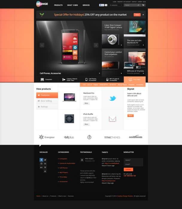
Our first contender in the list is Orange, a simple eCommerce multipurpose template.
The website layout is great to look at. It offers a nice menu social media icons on the left and search bar on the right. It is then followed by an image slider.
Overall, the design is quite amazing and great to look at.
SitePoint
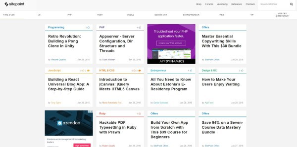
SitePoint is a well-known technology blog that aims to deliver completely unique and high standard articles on programming languages and other tech related stuff.
They utilize a very popular grid type website layout. For many, the website might not be stunning. But, the simplicity with which the website is laid out, clearly makes it more stunning that anything else.
In the web world, usability is an important factor and that’s why SitePoint has made it to the list.
Desktime
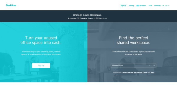
Desk time is a split screen website layout. The philosophy behind the split screen website layout is to give attention to two sections equally. For example, a company might want to market their product and themselves as well — a split screen is a the best way to go.
Mostly, split screen works in a vertical manner to express duality.
Foreword
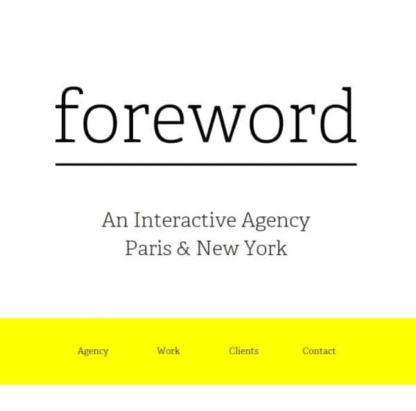
“Foreword.io” is an interactive agency located in Paris and New York. The website utilizes quite a unique website layout — Container-Free Layout.
Basically, any website layout has different sections. Each section of the website is separated with a visual clue. But, the container-free layout is a complete opposite of what we have been used to see.
The website uses no visual margin and all the sections of the website are floating on each other. This improves the visibility and improves the minimalistic design of the website.
TrueTea
TrueTea utilizes the 5 boxes layout. The layout is quite popular with many websites out there. It fits the needs of a product or a service where the information can easily be shared with the audience.
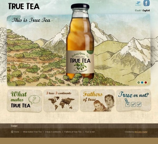
The website also utilizes hand drawn styles, gradients, etc.
Notepad++
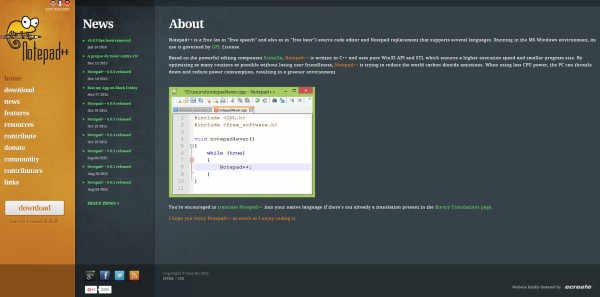
Notepad++ has a unique website. It utilizes a three vertical section layout. The left section contains the menu, followed by a news section and then a big section containing all the information.
The website design is unique and follows the suite of usability over stunning bling-bling effect. The color choices are also excellent.
HatchCollective
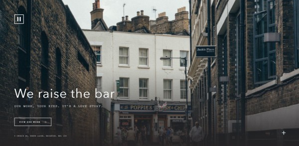
HatchCollective utilizes the single screen website layout design. This layout started getting traction in 2015.
The design seems to be a great choice for responsive layout. There is no scroll bar for the websites at all. And, the focus is shifted towards the content of the website.
The layout is well-utilized by HatchCollective and can easily be used by web designing or product companies.
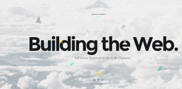
Nikolaylechev
Another website that utilizes the single screen website layout design. The website is just amazing to watch.
If you move the mouse, a seamless animation kicks in, providing a great experience of depth in the clouds. The tagline “Building the Web” surely makes its presence felt.
Wrapping Up
With 90% of the website using almost the same layout, you might think why there is no variety? The answer lies in the requirement of the clients. No one is looking to change the world with their new website. Most of the clients require a working website that looks clean, usable and professional.
In the article, we went through some of the newest website layouts. Some of them are stunning and impressive, others steal the show in usability.
Overall, I loved writing the article. If you felt that you learned something new and exciting, don’t forget to share it with your peers!
Also, comment below and share the unique website layout that you have seen recently.


No Comments