12 Nov Don’t Sleep on These Five Conversion Rate Optimization Tactics to Boost Your Sales
You could have a beautiful website and get tons of traffic. However, if your visitors are not converting, you’ll need to apply some tweaks, reassess your strategies, and use the best-fitting tools to turn visitors into paying customers effectively.
Achieving this might even require the help of an award-winning digital marketing agency. The good news is, we’re here to give you a hand. This guide lays out five conversion rate optimization tips and tricks to supercharge your website and, in turn, help your business make more money.
Table of Contents
1. Provide Effortless Navigation
 If your website is confusing to navigate, visitors are more likely to abandon your site in seconds. You’d lose tons of conversion opportunities and seriously hurt your bottom line. To keep this from happening, ensure your visitors can browse through your website with ease. Make your site navigation so seamless that even first-time visitors can get to the page or section they want within two to three clicks.
The easier it is for visitors to find what they want on your site, the higher the chances of buying your products. Learn from these tips to provide effortless website navigation for your potential customers.
- Avoid using false bottoms. False bottoms can look like users can’t scroll down when there is content below the fold. It can easily confuse your visitors, causing them to abandon your website in a snap and raise your bounce rates.
- Apply affordance signifiers to interactive elements. Your interactive elements and buttons should look clickable. This way, visitors can easily see them, allowing quick and easy navigation.
- Ensure clear navigation labels. Your navigation labels should tell your visitors what to expect when they click a button or element for easy browsing.
- Adhere to web conventions. Follow the general web guidelines to provide your visitors with familiar website navigation experiences, simplify browsing your site, and improve user experience.
It’s always good practice to prioritize your website’s usability over aesthetics by simplifying your site navigation. Leverage one of the popular and most accessible ecommerce platforms to use. Most of these platforms offer customizable templates designed with the best site navigation practices in mind.
2. Optimize the Checkout Process
It’s often frustrating when visitors get to your checkout page and leave your website at the last stretch. While many factors can cause this, one of the most significant factors that might keep customers from completing the purchase is a complex and confusing checkout process.
The solution? Simplify and optimize your checkout process. Below are some checkout optimization tips to help encourage your potential customers to complete their purchases.
- Limit distracting elements. Keep the number of elements on the checkout page to the essentials (and at a minimum). It helps shoppers focus on the item, its value, and why they should be buying it, encouraging them to complete the checkout process.
- Be transparent about additional charges. Surprising potential customers with additional fees, such as taxes, can discourage them from completing the purchase. Display additional charges as early as possible, so shoppers know the total amount they’re paying from the get-go.
- Set proper expectations. A lengthy checkout process can frustrate potential customers, so set expectations by using a progress indicator and showing the next steps. Use specific labels and directions to tell users what each stage of the checkout process entails and indicate when they complete every step.
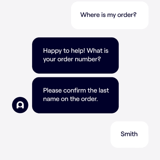
- Provide a shopping bot. Offer instant assistance as customers go through the checkout process using an Artificial Intelligence (AI) chatbot for customer service.ADA’s chatbot for eCommerce is an excellent example of this.

Image Source: Ada.cx
With AI chatbots and shopping bots, potential customers can quickly answer questions about your shipping options, delivery dates, and other common inquiries, which helps provide a smoother checkout process.
3. Leverage Countdown Timers
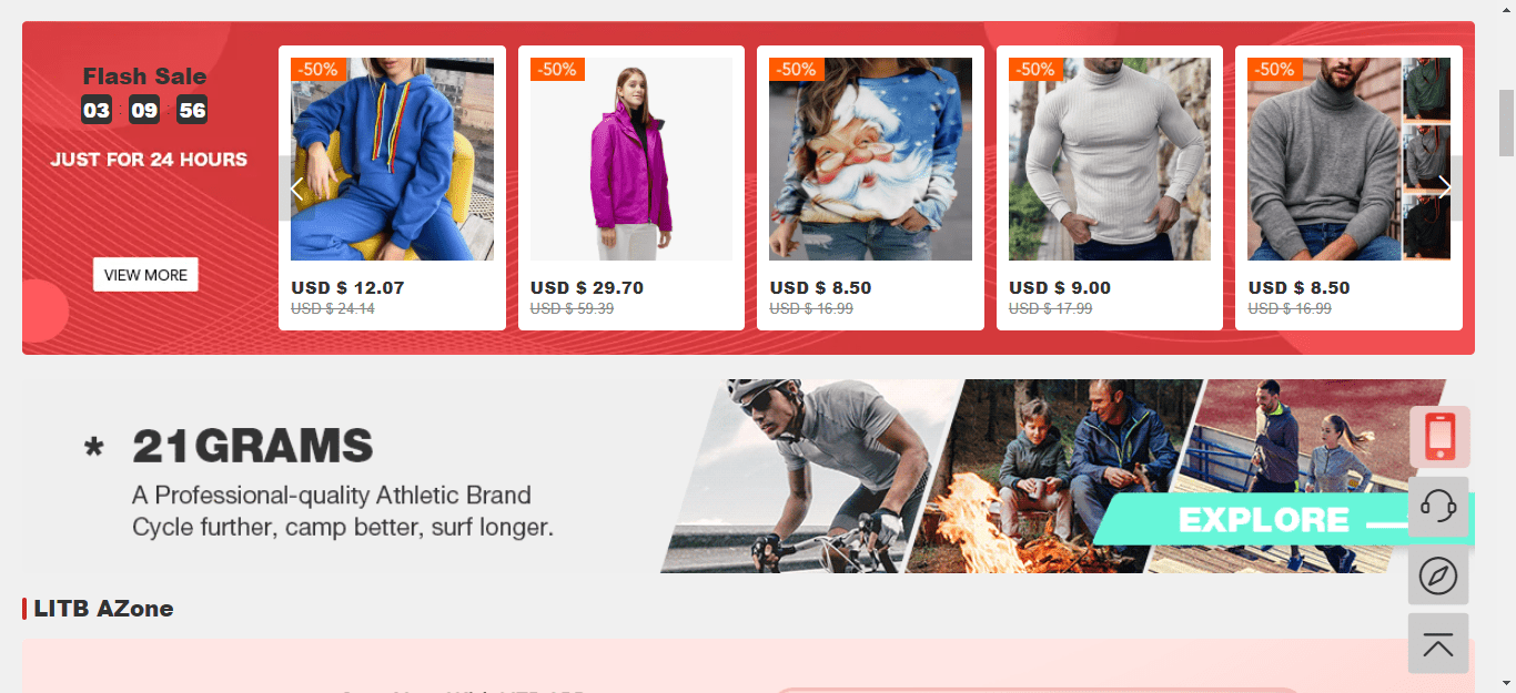
The longer it takes for people to decide on buying your products, the higher the chances of them changing their minds or getting distracted from purchasing. An excellent conversion strategy is to create a sense of urgency by using countdown timers.
For instance, you can display a countdown timer on your home and product pages to show time limits for your ongoing flash sale.

Image Source: lightinthebox.com
You can also offer free shipping for a limited time to support implementing product descriptions that convert. These tactics can give potential customers that final nudge they need to buy your products, or they’ll miss out on great deals.
Play into your prospects’ fear of missing out and strategically provide time-limited offers and display countdown timers. Nail this to help optimize your promotional and conversion efforts and improve your sales.
4. Conduct A/B tests of Your Headlines
Your headlines can make or break your landing and other web pages and, in turn, your conversion rates. One way of ensuring your headlines can help bolster your efforts and allow you to achieve your conversion goals is to perform A/B tests. It enables you to conduct experiments to assess which variations your target audience responds to best and gain excellent returns.
When testing your headlines, include variables such as the length and tone, including the use of numbers and stats. For example, you could conduct an A/B test on your blog post headline with one variation saying “Summit vs. Conference” and the other “The Difference Between a Summit and a Conference.”
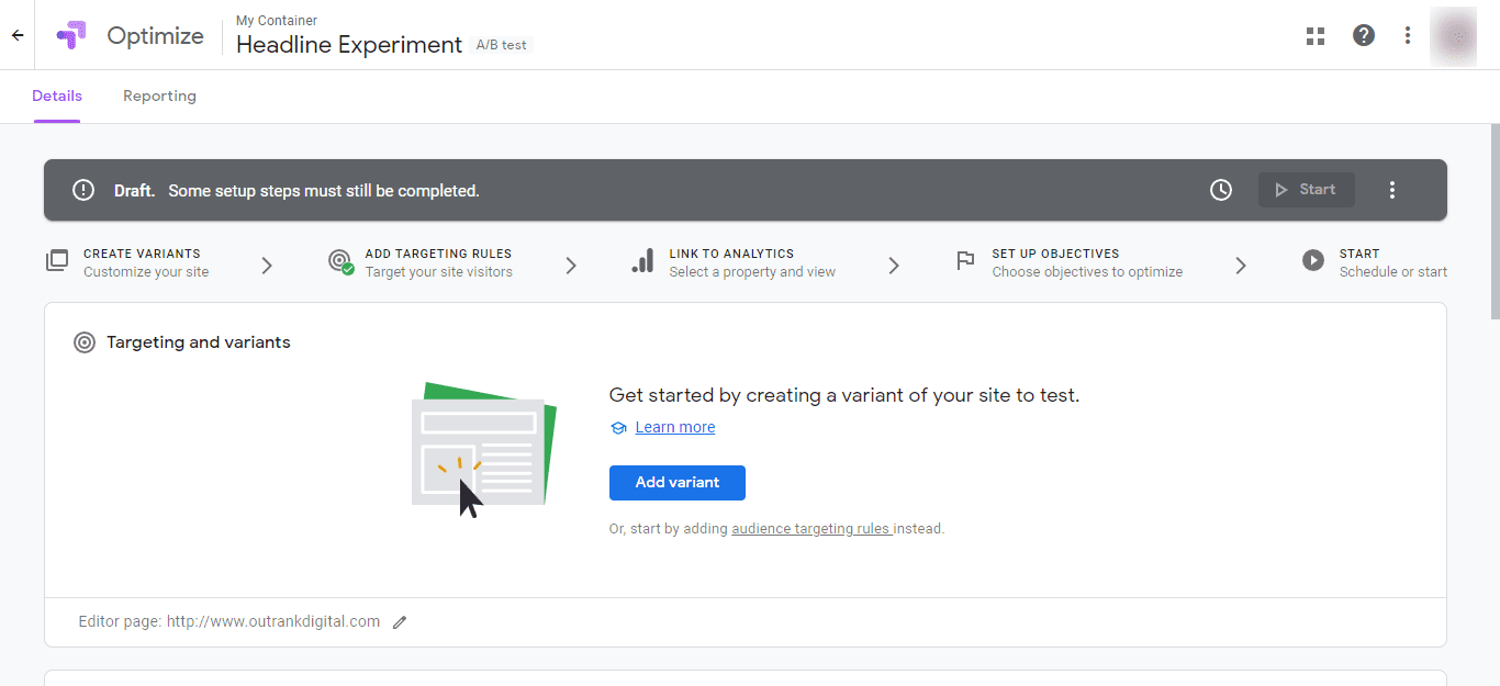
Doing so helps you determine which headlines can get the best responses from audiences and drive conversions ultimately. Additionally, use reliable A/B testing tools such as Google Optimize to run experiments efficiently.

Image Source: optimize.google.com
With A/B testing, you can learn which headlines and content work best for your audiences and drive conversions and sales effectively.
5. Use Popups Strategically
Regardless of how excellent your website is, some visitors can still be on the fence about buying your products. The good news is, these visitors don’t always have to be lost causes. You can implement last-ditch efforts to get at least some of them to stay and convert by using popups.
While popups can be controversial regarding usability versus effectiveness, there are strategic ways to use them effectively and encourage conversions.
Those ways include:
- Using user-behavior triggered popups. User-behavior-triggered popups help ensure you deliver relevant content to visitors instead of random offers that can turn them off or annoy them. For instance, if a visitor has viewed at least three product pages in the same category, trigger popups containing offers related to the items.
- Providing clear CTAs. Give your visitors a compelling reason to act on your offers by ensuring your CTAs can tell them the benefits of signing up or buying. When used strategically, popups can help you engage visitors, grow your email list, promote your offers, and ultimately boost your website conversions and sales.
Ready to Give Your Website Conversions a Boost
There might not be a one-size-fits-all formula to optimizing your website for conversions, but the tips in this guide can give you a good head start.
Leverage these conversion rate optimization tactics and start seeing significant improvements in your results, which helps you set your business up for growth and success.


No Comments