09 Jan 7 Exciting Web Design Trends You Can No Longer Ignore in 2021
2018 has finally ended and it hasn’t been long since we stepped into 2021. With new resolutions and trends present all over, website designing is also going to come up with a new face. In fact, the entire concept of designing a website has eventually changed for the better.
In this piece of writing, we will be checking out such excellent web design trends of 2019 which you can’t afford to miss. Read on and get an idea.
- Broken grids and asymmetrical layouts
Of course, this was one of the best website design trends of 2018 but the scenario seems to be the same in 2019 too. The grid, in terms of website design and development, is considered to be an imaginary plane with horizontal and vertical lines. It is typically used to help layout elements on the page or screen.
Now, when it comes to broken grids then we can expect items on the website being pushed around on this plane in such a way that it makes the grid feel less rigid. This type of design, along with asymmetry, is pushing the boundaries and in the coming months of 2019, it is anticipated to be making more of a statement on the web.
- Organic design and elements

It is one of the biggest website design trends which will simply upgrade the website designing scenario like never before in 2019. The website designers are no longer interested to pull away from the straight lines which come with flat design. Rather, it is all about more fluid shapes and lines. In 2019, web designing is more about organic shapes rather than typical circles, squares, rectangles etc.
- Retro design style

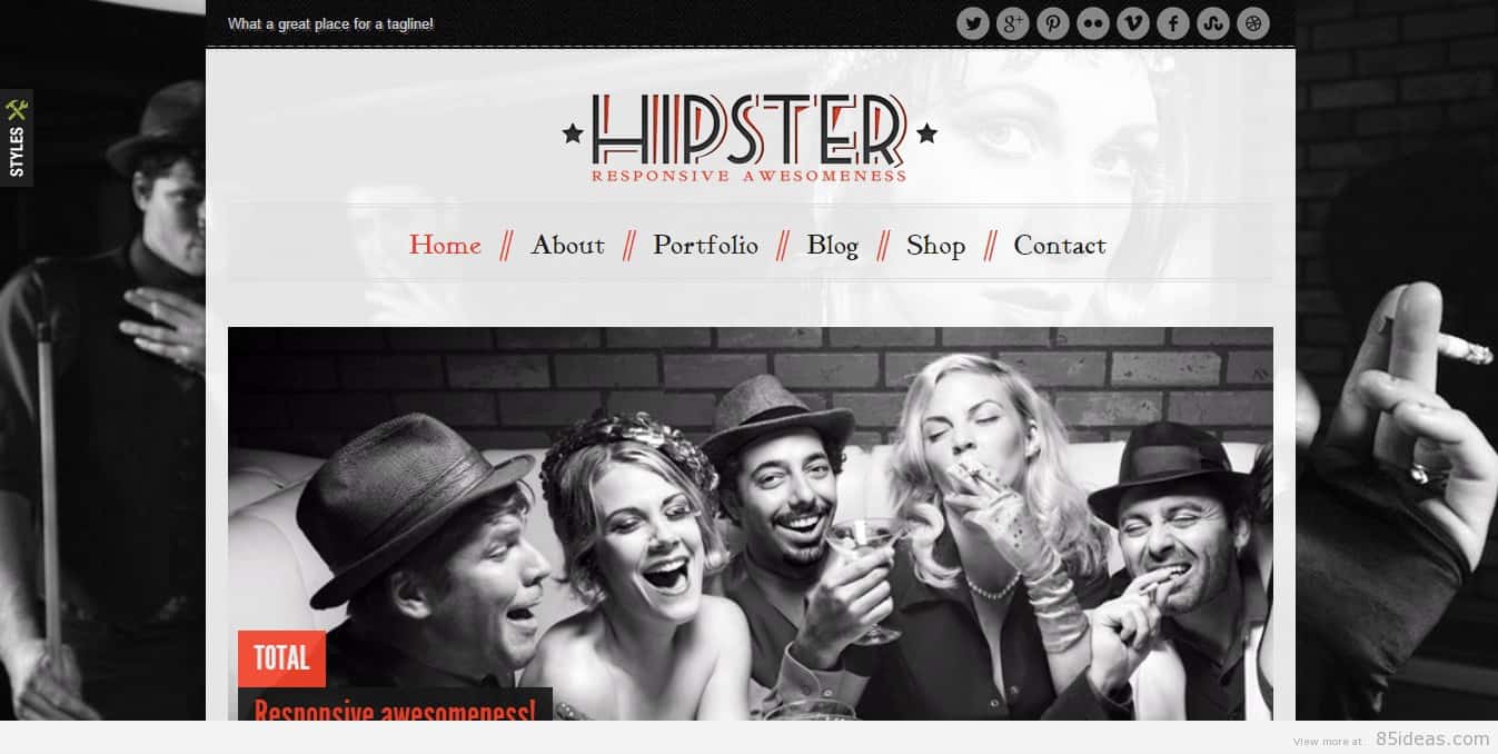
What was old has become new again. As 2019 is going to be all about moving beyond flat designs, it is evident that experimentation is constant now. With that, old design elements are making a grand comeback now with, of course, a powerful hint of nostalgia.
This kind of experimentation with nostalgia and retro design styles is creating an amazing juxtaposition of old and new website design trends.
What seems to be pretty interesting about this trend is that we can witness a variety of retro design styles showcasing various time periods which were prevalent before the websites were readily accessible to masses.
Isn’t it amazing?
- Enhanced image treatments
Images have been always an integral part of website designing and they provided exceptional designing opportunities. Putting images in circles, incorporating a drop shadow between pictures and graphics have been some of the most conventional ways always.
However, 2019 is one more step ahead. This year is all about taking the image treatment one step further. Still, now, we’ve seen websites featuring a huge hero-style image which spans the whole width of the website but in 2019, the scenario is expected to change.
The experts believe that it is more about not changing the image too much and rather taking up a great deal of height will pick up more traction in 2019. Precisely, 2019 is going to be all about changing up the way images are presented in websites.
- Monochrome and absence of colour
Of course, having millions of colours on your website is really something awesome but if you limit yourself to one or no colour then it can be something extraordinary. If done cleanly, this kind of design can enhance the entire visual impact of your website and make it memorable. And, 2019 has certainly welcomed this trend with open arms.
- Huge and experimental navigations
To integrate a function with the navigation of the website has become a common theme every year. In 2019, it is going to be the same. The major factor which will play a role here is a significant deal of experimentation with the navigation icon. It is not just about its placement on the page, font size, or even the layout itself. Rather, navigation is expected to be turned into the major part of a website or a large focal point.
- A large white space
The use of extra white space in a smart way has become one of the best ways to give your website an altogether new look in 2019. You can add margins or spaces to give your eyes a rest. One of the amazing web designing trends could be adding extra space which can move it to a remarkable focal point or an important part of the design aesthetic.
Hence, 2019 is definitely going to be a year where we would see a lot of websites making a statement with white being rightly organized. Although, using a major extent of white space in the websites might have proven to be a waste of space but in 2019, the scenario is exactly the opposite!
Summing Up
Aren’t these web design trends developing to be excellent?
Make the right use of them while designing your website effectively and you will definitely end up with a perfectly curated one for the year 2021.
–
ABOUT THE AUTHOR
Maulik Patel is Founder & Director of ClickMatix.com.au. His passion for helping people in all aspects of online marketing flows through in the expert industry coverage he provides. He is an expert in Web marketing, Search Engine Optimization, Social Media, Affiliate Marketing, B2B Marketing, Online Advertisement of Google, yahoo and MSN.
image source – getemtiger.com


No Comments