


26 Jan Here’s Why Your Sign-Up Form Is Killing Your Growth: Actionable Takeaways
Registration forms serve as entry points for new leads. If you get it right, it can be one of the most vital factors to grow an organization at a far faster rate. But if you make a mistake, you’ll have to keep working on it.
Marketers often fall into two categories when creating sign-up forms: those who want to collect as much information as possible and those who want to eliminate friction at all costs. Your choice here will major impact your company’s lead capturing approach.
Therefore, it is worth your time to read this blog, as it will help you make successful sign-up forms and prevent them from killing your growth.
Table of Contents
Why Having a Sign-Up Form Is a No-Brainer
 Potential conversions take place on sign-up forms. Put another way, sign-up forms are where the money is made. It is where businesses get personal with their potential customers in the digital age and collect emails, leads, and distribute content. In a nutshell, sign-up forms are at the heart of many online interactions.
As per the resources, 50% of marketers say inbound marketing strategies, such as onsite forms, are their primary source of leads.
- Sign-up forms are where leads are generated if you’re in the service industry.
- If you work in eCommerce, these forms are where the potential customers ensure that they want to make recurring purchases.
- These forms are where you get customers if you’re operating a SaaS firm.
As you can see, sign-up forms are an essential part of the jigsaw. It’s no wonder that ignoring the addition of sign-up forms is bad for business. Even a single blunder can cost a business dollars in losing sales.
Figuring out what’s incorrect with your sign-up form takes time because it requires an individual or a team to do A/B tests and use analytics solutions to look for improvements. We’ve mentioned the main reasons and best practices for making sign-up forms that worked for various organizations to cut short your research process.
Reasons Why Your Sign-up Form Is Killing Your Growth
1. Adding Unnecessary Fields
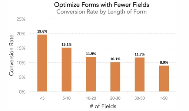 The first step to creating an outstanding sign-up is valuing your potential customers’ time; otherwise, your conversion rate will suffer. There are some situations where this is unavoidable, but when it comes to your website, think hard about it before asking your potential buyers to fill out a section that is unrelated to the action.
In the same way, everyone does not tolerate excessively broad fields and extra properties. Therefore, keeping the sign-up form short and crisp with a clear CTA is suggested, preventing the customer from becoming frustrated and abandoning the page amid the procedure.
Begin by questioning the most relevant questions first, then delete the options for additional contact numbers, email addresses, and home addresses. Further, you can incorporate progressive profiling into your lead generation plan and follow up with extra questions after the lead has been verified.
2. Having Captcha and Password Authentication
 One of the most critical aspects of doing business in 2021 is respecting users’ time. For having a win-win situation, companies should chop off all the unnecessary steps that consume users’ precious time, such as authentication through OTPs and the use of passwords.
Research shows that 78% of the people face “forgot password” issues that eventually increase the bounce rate of the sign-up forms. Similarly, many people face problems in receiving OTPs, and these things eventually result in an overall bad experience for the users.
Many websites are using tools like SAWO for one-tap authentication of the users and help them go passwordless and OTPless. Utilizing these authentication tools results in 75% less authentication cost and provides users with a smooth experience.
3. Not Offering Incentives
Offering any incentive to a sign-up form can significantly enhance your conversions. Why not give subscribers a free booklet or whitepaper? Alternatively, how about a phone or email consultation? If you’re offering a premium membership, try providing new customers a free monthly subscription so that they can have some benefits for subscribing to the higher plan.
People enjoy receiving gifts. It gives us the impression that we are getting a better deal. Because of all the “free” items you’re getting, anything that might look expensive at first appears to be a deal. You may tap into the same psychological impulse by providing an incentive to your clients.
4. Poor or No CTAs
A call to action is highly crucial for any sign-up form, and without this, the form would be completely useless. It blends into the backdrop, or it’s the same color as other buttons on the website, or it doesn’t strike in any way. Despite this, many websites don’t pay much attention to it and make the CTA almost unnoticeable.
Therefore, always ensure that your call to action is differentiated from other pages and use contrasting colors, a bigger font, and visible placement. Also, always run A/B testing for your CTA. Some phrases may be more effective than others, and one-button color may be preferable to another. The only way to be sure is to try all conceivable combinations.
5. Not Using Placeholders
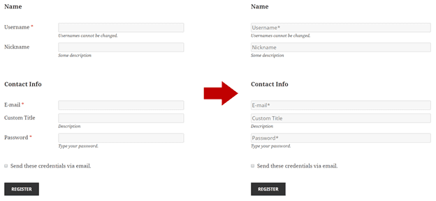 Even though the field labels are enough to tell users what the form is asking for, there are still chances that users will submit incorrect information. It occurs when designers don’t have a placeholder, which is a typical mistake.
Place holders, like field labels, are an important component of a decent sign-up form. Placeholders are text properties that tell users about the information entered, comprising its context and format, such as alphabetical or alphanumerical. If the user input is lacking, the placeholder notifies the intended value of the field.
Advanced Tips to Have More Conversions Through Sign-Up Forms
 1. Replacing Passwords/OTPs and Security Concerns
As mentioned above, Passwords and OTPs come with lots of friction for users while filling up the sign-up form. And not only this, but they can also security issues and data breaches that will end up creating a bad reputation for the organization.
Passwordless authentication tools are appeared to be a one-stop solution for all such serious issues. Since they don’t store any data, there is no chance of breaching- creating a safer environment for both users and the organization.
2. Add Social Proofs
Since social proof taps into our deeply ingrained social inclination, adding links on sign-up forms helps businesses get more conversions.
Showing your visitors that others have done the same improves your brand’s trust and enables you to increase conversion rates: it’s all about persuading them to take the following steps.
3. Use Popup Forms for Sign-up
Going to a different sign-up page is a psychological hurdle, and therefore, most organizations use a modal window for sign-ups. Adding a modal window in conjunction with a short sign-up form can improve sign-ups by 50%, as analyzed by Visual Website Optimizer.
Because it shades out all information except the form, the modal window has the added benefit of reducing interruptions on the sign-up page. It lowers the probability of the visitors getting distracted by different links or something else on the page and skipping the sign-up form before it is completed.
4. Focus on Spacing and Formatting
The visual appeal of the sign-up form is mainly determined by insufficient space and arrangement. Owners of websites that ignore this critical component frequently complain about unjustified conversion drops.
A well-structured layout with a suitable hierarchy across field groups and pertinent attributes ensures a smooth client input flow. It also makes it easier for the site owners to view and manage the data once the sign-up form has been received.
5. Send Confirmation by Mail
 Surveys show that confirmation emails are among the most critical emails that users expect, as they are required to tell the user of their successful sign-up. However, in most cases, designers and marketers overlook this vital feature. Confirmation emails might bog down the registration process, but receiving incorrect data is considerably worse.
Moreover, customers who provide information also get concerns about the platforms’ validity, security, etc., and sending a confirmation mail removes all such doubts and conveys a positive image of the brand. You can include a personal note to inform users about their sign-up success based on your preferences.
Three Golden Seconds to Success: Final Checklist
 “You have 8 seconds to get your internet visitor’s attention,” claims an old internet proverb. But according to some sources, today’s duration is only 3 seconds. Therefore, go through this final checklist to grab the attention of your visitors within 3 seconds and increase your conversion rate:
- Make your sign-up form dimensions as large as possible. Most people prefer to use a mouse to point and click on each field when inputting information rather than scrolling through the fields. It is considerably easier for them also read the content much more clearly and remove other distractions from the screen.
- Ensure that your customers don’t have to remove any input text to fill out their forms, which wastes their time and slows down the registration procedure.
- Always go with a one-column layout whenever possible because tabbing through two-column forms confuses the customers.
- Ensure to include passwordless verification as users often forget the user id and password, which eventually affects the bounce rate. Also, adding them eliminates the need for captcha that also cut-shorts the overall time and improves user experience.
- Keep the sign-up button large and prominent, with a clear call to action. Make it big and bold, and don’t forget to tell people what they will get after giving their crucial information.
Wrapping Up
While sign-up forms are a great way to increase conversions and acquire vital consumer information, creating a successful sign-up form requires a lot of research. While designing your sign-up form, consider factors such as the product/service you’re offering, the targeted audience that visits your site, and the vital questions that you must ask. The points mentioned above are the best strategies for optimizing your sign-up forms for maximum effectiveness.
With tools like SAWO, businesses increase their conversion rate as issues like “forgotten passwords” and “OTPs not getting delivered” are eliminated. The best part is that now businesses can remove the use of passwords for users to authenticate and sign-up through the forms. This ensures a seamless user experience and enables users to sign up within the minimum duration possible.
No Comments