12 Jun The Worst Logos Ever Designed
Logos are an integral part of the brand identity, it has the capability to make or break a brand in the eyes of a perceptive customer. Often people start associating a brand logo with the services of the brand, sometimes it signifies the brand’s journey over the years as people already recognize it. The swoosh of Nike or the three pointed star surrounded by a ring of Mercedes Benz, is instantly recognized by people and is a part of brand identity, value and achievement over the years.
Marketers stress the need to have a logo as part of the brand identity and they are used in the brand campaigns to give the company their identity or a strategic shift in the policy or direction of the company. Logos are supposed to communicate the essence of the organization. The combination of design and typography can create a stunning logo.
Unfortunately, not all companies and firms get it right with their logos, some of them clearly redefine the levels of how wrong one can go while designing logos. The first criterion of logo designing is that it should grab the viewer’s attention. Some of the graphic designers don’t get it right and clearly grab the eyeballs for all the wrong reasons. Every company wants to design a good logo or hire designers to create one for them. We have compiled a list of some of the worst logos ever designed that should never have been used. Be warned some of them are X-rated, unintentionally of course!
Table of Contents
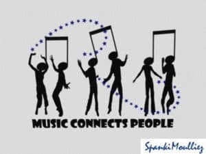
Music Connecting People

At first the design doesn’t look like there is something wrong with it, but an attentive eye is all you need to spot the error. It seems more that music killing people than music connecting people.
Pepsi

Pepsi has struggled with its logo design unlike Coca-Cola that has established itself a brand that people cherish. Pepsi has a good logo and it spent millions to get a logo design that has been much talked about in the design community. They seem to have let out the effects of having the drink because of its sugar content.
Arlington Pediatric center

Certainly it is not the kind of a pediatric center that any parent would be interested in going, inappropriate placement of the child in the logo.
Clinica Dental San Marcelino

This is a logo of a dental clinic, although it doesn’t seem like one. It looks like some interesting kind of dental service.
Kids Exchange

Putting those words together is the biggest mistake they could have ever made, this one clearly shouldn’t have gone beyond the draft stages. Wonder who sends their kids here.
London Olympics

The logo for London Olympics was quite disappointing, especially when so much was spent on it. It drew ire from the designer community and others alike, some say it resembles a broken swastika or if you see carefully, you would probably want to unsee it.
Mega Flicks

This is the logo of a video rental store, a logo that definitely needed a different font than this. This screams attention for all the wrong reasons.
Junior Jazz Dance Classes

This may take a while to understand but if you get it, you’ll never see those two dancers. If you focus on the negative space, you’d get what they have designed.
Bing

With the launch of Bing, Microsoft’s replaced Live Search with Bing to take on Google. It was nowhere close to Google, but before it could make a mark, it was trashed by the designer and the online community alike. It looked like 4 bloated letters badly put together, the logo was highly unflattering and sad. It wasn’t expected of Microsoft that was considered good with designs to come up with something as sad as this. Thankfully, this was changed in 2013 but this made to the worst designed logos of all times.
Safe Place

The logo for a place with a name like Safe Place definitely should have a better one, this doesn’t look like the safest of the place. The logo seemed to be designed in a haste without much thought over the design.
The Field Center for Children’s Policy, Practice & Research

Another logo with the inappropriate place chosen for the child, this isn’t expected from an organization dedicated towards children.
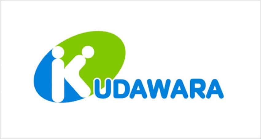
Kudawara

Those two dots over the letter ‘K’ took this logo to another level, you don’t need to have a sick mind to understand what’s wrong with this logo.
Highlight

I wonder how this logo didn’t give a headache to the designers of the logo, amazed how someone can design a logo that can give you a headache. There is a reason that they are not famous and probably you might have never heard of them.
Hilary 2016

The logo for Hilary Clinton’s campaign seems to be designed for a healthcare service or a hospital or probably a signboard for a hospital ahead. Hilary certainly could have come up with a better logo, wonder how she approved this one.
Institute of Oriental Studies

I fail to understand what the thought behind the logo was or what was the message that the designer wants to put across. It is hard to notice the obvious in the logo, has to be among the worst designed logo of all time.
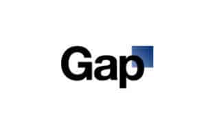
Gap

Gap changed its iconic logo that was carried over for years to give the brand a new life after drop in sales in 2010. But the logo was changed only because they felt it was around for 20 years, there was no need to change until they were changing for the better. The new logo was a disastrous one that looked like it was made in paint with a simple font, they suffered a backlash and were quick to switch back to the old one within a week.
Wrapping Up
We hope that list has made you more aware about how logos are perceived and what all can go wrong with a logo. If you know of any logo that has caught your attention for all the wrong reasons, let us know in the comments below.
If you like our effort, consider sharing it in your social circles.


No Comments