

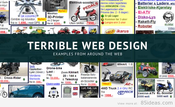
06 May 8 Examples Of Bad Web Design in 2021
The web has come a long way since its first appearance in 1994. However, there are a few websites still living in that era. In today’s article, we will look at creating a website in the 20th century. The web designs mentioned below are a great example of a bad website design and should consider updating to serve the tech-savvy users of 2021. While reading this, please keep in mind that this is my opinion, and I would love to know whether you agree or disagree with me.
We also recommend reading:
- 2 Amazing Examples of Parallax Scrolling Websites Inspiration
- How to Create and Grow Your WordPress Blog
- Great Examples of Big Brands Powered WordPress Websites
Examples of a Bad Website design
Create a trustworthy design now.
Design is the key factor in all websites. It doesn’t matter if you are starting a small business; you will require a professional designer to assist you with the design of your website. It can be a great idea if the developers and designers can combine efforts from scratch using the best design collaboration tool.
Creating a functional and stunning website is not as simple as many people think. Get an experienced consultant to assist you when analyzing the behavior of your target audience, then build and implement an excellent UI, having one thing in mind, and that is giving the best experience to your customers.
It is essential to learn the mistakes of web design and ways to avoid them. If you are still confused, continue reading this post to get elaborate information on what a good site should be looking like.
Trends in bad website design change almost every hour. Therefore, design principles are challenging to predict, but you can still use the existing principles. I have researched many websites and discovered many design principles. These are;
- Navigation that is simple to understand
- Use of animation appropriately
- Use of a design that is relevant to the theme or the content.
- A neat layout
- Best color schemes
- Eye appealing site
- Arranging the content and design elements
With so many new devices of various screen sizes and where users are now prepared to wait around for your site to load. There can’t be any room for bad web design if you are serious about your business.
Just in case you are the owner of any of these sites mentioned here, here are my top tips on how you could improve your bad website design trends.
- Make your website is responsive, meaning it adapts to the user’s screen size allowing a seamless experience alternative have a mobile version of your site created.
- Ensure that your website is easy to navigate and clear layout. An old-school rule of thumb is to ensure your user can reach their destination in under three clicks.
- Avoid flash; if possible, search engines can not read them, and some older browsers might block it together.
- Ensure your color scheme is easy on the eyes and compliment each other.
- Keep your site clutter-free, and I would personally avoid auto-playing music without a pause or stop button. There is some exception to this rule, but for the majority, it’s a no-no.
- Follow those five simple rules, and you are sure to have happier users.
Ok, so without further ado, here is my compilation of sites I would deem terrible in terms of bad website design.
arngren.net
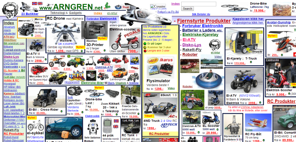
They seem to have some cool stuff selling; however, the design was way too overwhelming for me personally. A bit of tidy up and rearranging, and they would be onto a winner. I would suggest any of these eCommerce templates give Arngren a fresh look.
lingscars.com
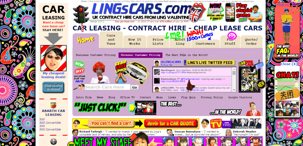
I have been a follower of this site since the owner appeared on BBC dragon dens, a great business, but her website, in my opinion, could do with a bit of de-cluttering.
irishwrecksonline.net

Again another exciting website regarding the information provided there’s a shame about the design.
art.yale.edu
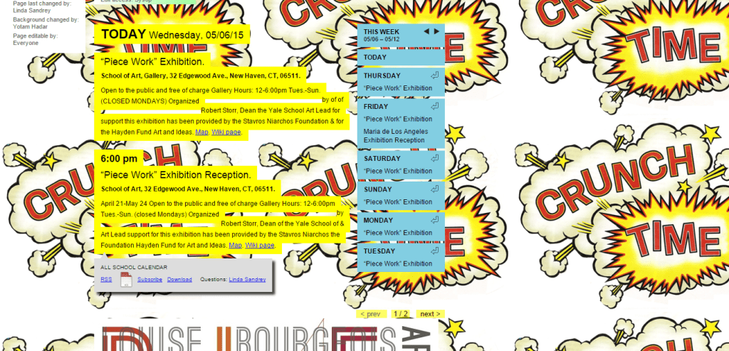
All the information you could want is there; however, the presentation could do with a little rearranging and a lick of paint. For Yale, I would suggest any of these education themes.
Pennyjuice.com
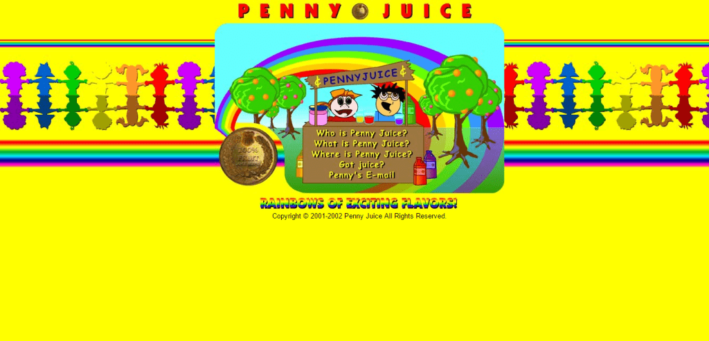
Here is a great example of how not to choose your color scheme. The site seems like a fun brand; however, the site needs a major redesign. Pennyjuice seems to be aimed at the child market, so I suggest any of these nursery-style templates.
suzannecollinsbooks.com
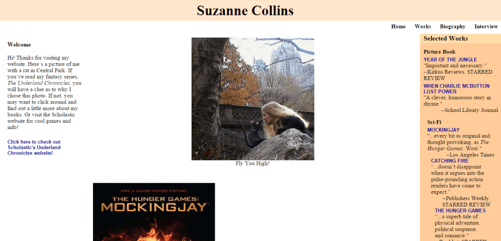
Out of all the websites listed here, this one is not such a bad website design because the information is there in an easy-to-find manner. It could do with being responsive, and a touch of paint would go a long way. For this website, I would suggest a personal blog template.
evangelcathedral.net

Really great cause, but they could do with losing for of those unnecessary flash. Here a few great alternative web templates for church themes.
industrialpainter.com
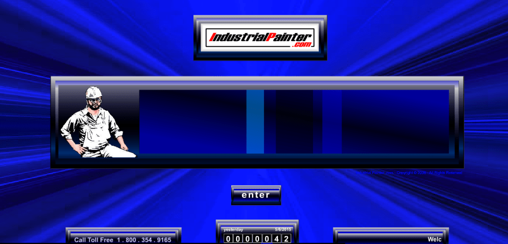
Another example of too much flash used and a very annoying voice in the background that you can’t turn off. To improve this site, I would suggest any of these portfolio themes.
How to Fix Bad Design
Now that we have looked at some evil website designs, it’s time to learn how to fix them. Of course, you can do so in the default editor, but it’s great to have additional help with plugins. Keep reading to find out which plugins can help you in creating a better web design.
UnderConstructionPage
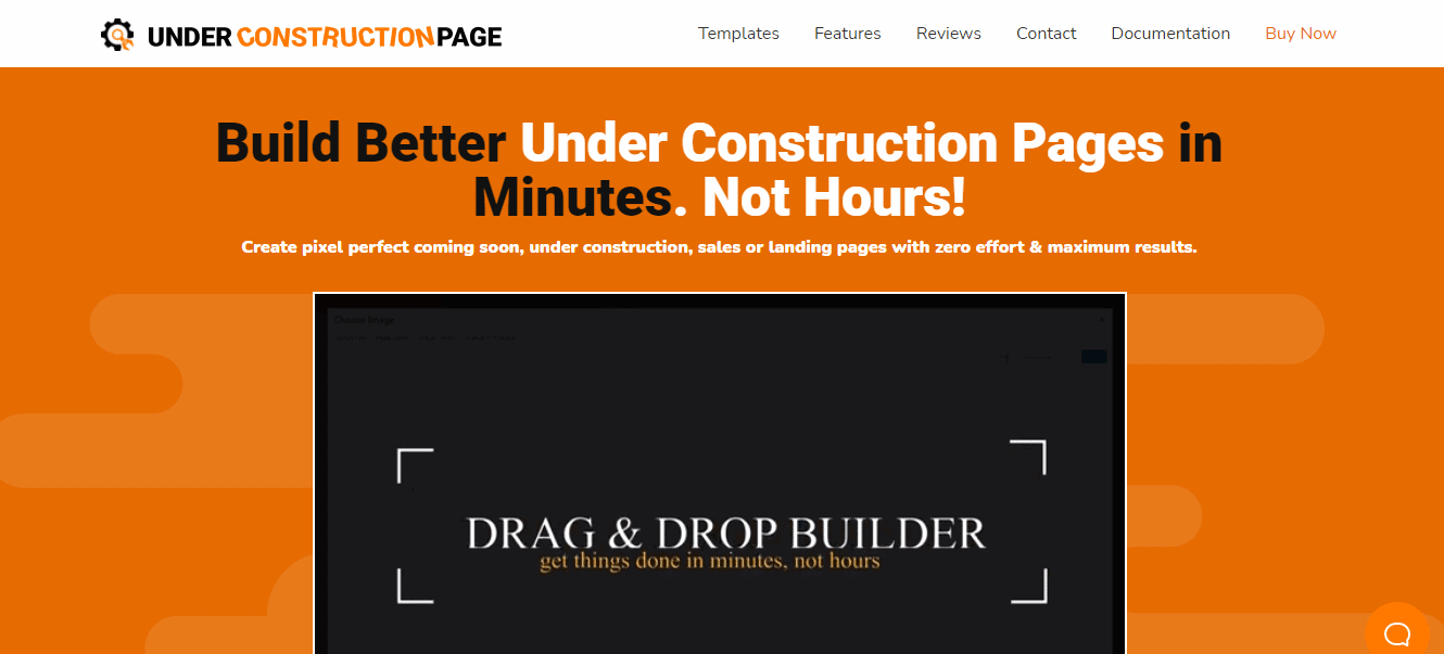
UnderConstructionPage is a plugin that will help you create a beautiful under-construction page to showcase your website while you are working on it. The plugin offers more than 2 million images for your page that will fit just right with your style and brand.
With the easy-to-use drag and drop editor, your page can be done in just a few clicks. 270+ templates are just waiting to be customized to your liking. Another great thing that UnderConstructionPage offers is an affiliate and traffic tracking, so you can know exactly how many shares and clicks your links are getting.
Coming Soon & Maintenance Mode
Next up, we have Coming Soon & Maintenance Mode, a plugin that will make sure your visitors are staying excited about new and better things coming to your website. With it, you can set a page that will inform all visitors there is something new on the horizon.
Coming Soon & Maintenance Mode offers more than 2 million images and over 170 themes to implement into your design. It has the best SEO setup, with built-in checks, tests, and guidelines to assure your website is up to speed. Furthermore, you can make this plugin yours as much as you want; change its name, logo, colors, and text.
WP Reset
WP Reset is the plugin you want to have in case of emergencies. Whenever you make any changes to your website, whether that is updating a plugin or just doing maintenance work, something can go wrong.
To solve any mistakes and errors that might occur, you need to be prepared. WP Reset has everything you need just for that purpose. When a plugin update messes up your whole design, you can reverse the damage in just one click. Similarly, you can also install any plugins as easily as that.
WP Reset’s recovery tool will allow you to access your WP admin when you can’t get access to it. Furthermore, it has all the cleaning tools you need to get your website squeaky clean.
One of the greatest features this plugin offers is the Snapshots option. It allows you to take a snapshot before making any changes and return to it if the change resulted in an error. Finally, the Nuclear Reset option will leave you with a bare website, ready to be made again.
Wrapping Up
Let me know what your thoughts in the comments below, which website was your favorite? Also, if you are the owner of any of the sites mention, no harm was intended and merely take it as free advice on improving your site.
The listed principles are simple rules of bad website design, however, it is already evident that the best web design must be eye appealing, simple to understand and simple to use. This shows that the best website must offer users with unique user experience. At this point, you should not give any excuses, just go through these guidelines once more and create a website of your dream.
Benjamin McMahan
Posted at 02:41h, 30 JulyYou missed one, the company that made industrialpainter.com – superior-web-solutions.com. Holy cow, what are these people thinking?! It’s 1994 all over again!!! AHHHHHH!!!
Vee2419
Posted at 13:32h, 24 FebruaryI was browsing articles for examples of bad sites to my web students, this gem has made my day. Thank you for sharing this!
Luke Castle
Posted at 11:09h, 15 MayOk but that site is so bad it deserves a award. Who would acully hire them lol
behindWP
Posted at 10:02h, 09 Junethis article tells clearly how the web design looks in the early years after the internet started